A Total
Rebrand.
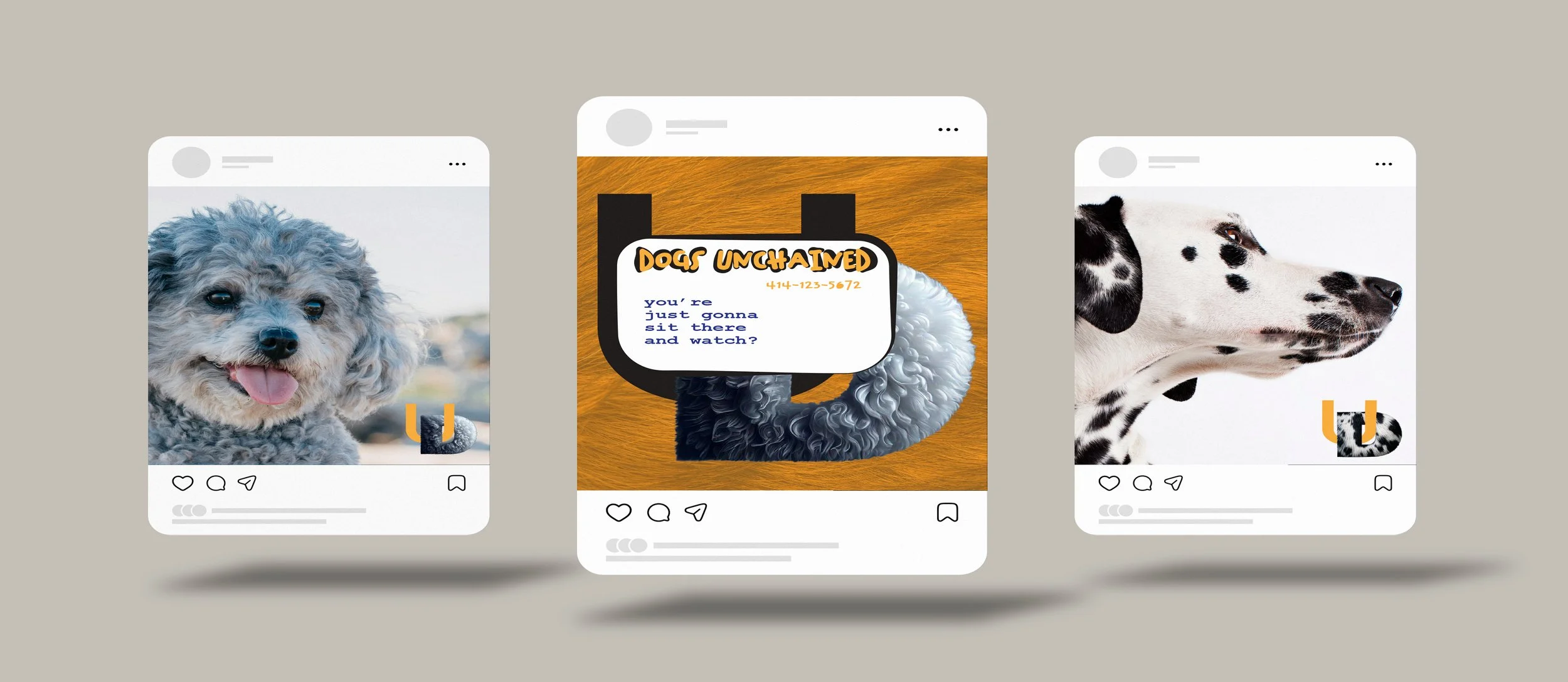
Unchained Dogs.
This rebrand reimagines Unchained Dogs with a renewed sense of purpose, empathy, and modern identity. The goal was to move beyond a simple logo refresh and build a cohesive system that reflects the organization’s mission — giving dogs a voice, dignity, and freedom.
From logo development to tone of voice and campaign visuals, this project explores how strong design can inspire awareness and compassion for rescue animals.
Branding Style Guide
Branding Style Guide
Color Palette
Fonts
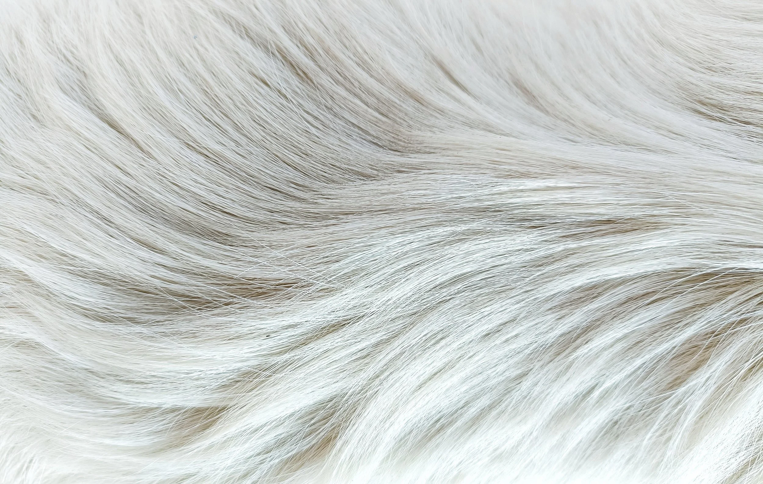
Textures

LOGO CREATION
LOGO CREATION
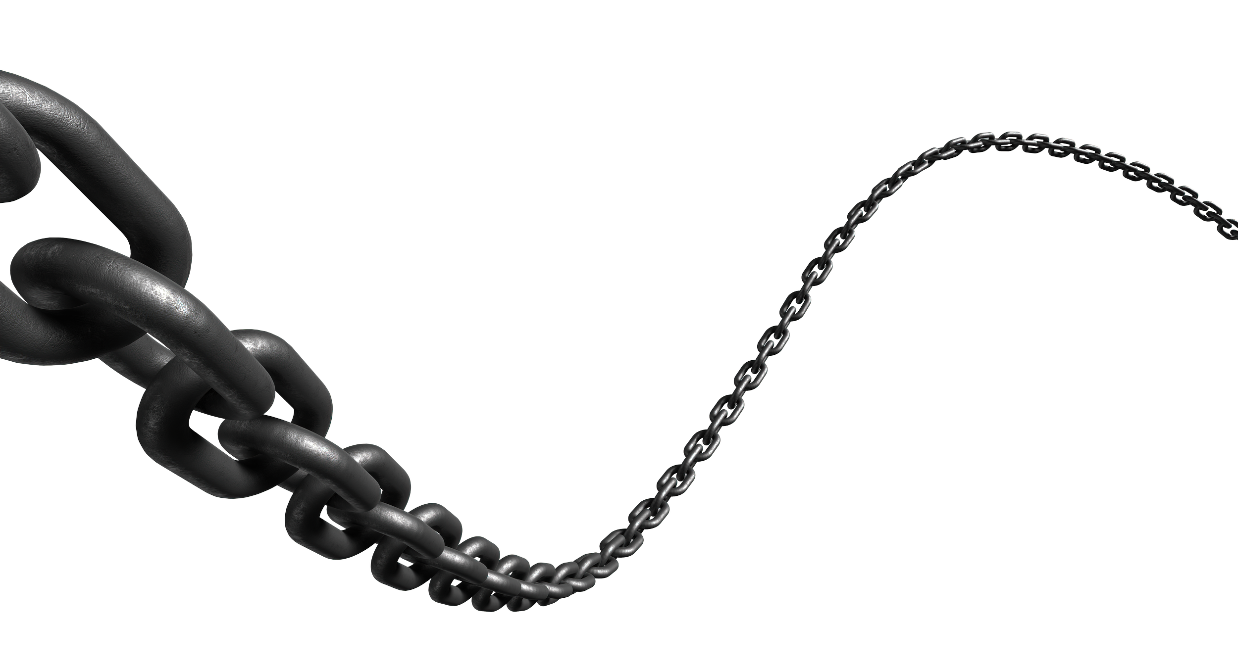
The Unchained Dogs logo began as an exploration of the letters U and D, a simple abbreviation that carried so much heart and meaning. I started by shaping them into a lock — a symbol of both captivity and the hope of release — but as I developed the idea, it evolved into something more intimate. The U and D became intertwined, representing the bond between people and dogs, and the act of unchaining not just physically, but emotionally.
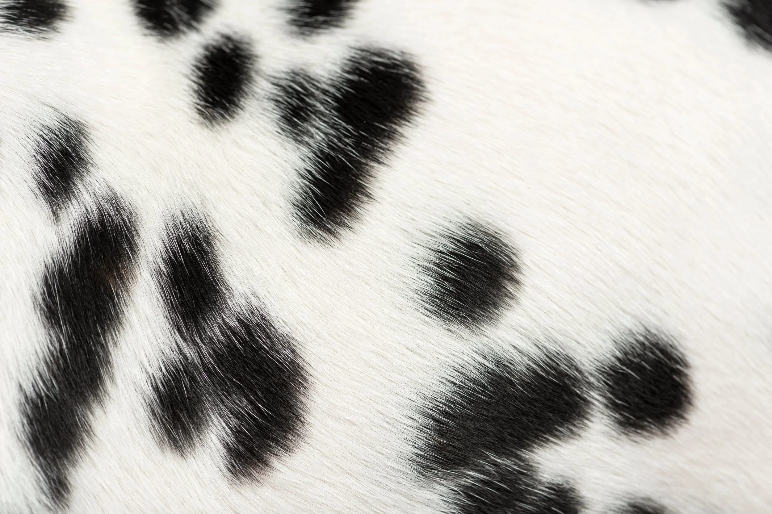
In the final design, I let simplicity lead the way: the clean, modern U sits beside a D that quietly transforms through fur textures, each variation symbolizing individuality, life, and the spirit of every dog the brand stands for. This logo isn’t just a mark — it’s a story of empathy, freedom, and connection.
RATIONALE:
Start to Finish.
-
![]()
Design #1
I started off using the U and D for Unchained Dogs and designing a unified lock with the letters.
-
![]()
Design #2
I kept playing on Illustrator with strokes and different widths and an added lock emphasizing freedom.
-
![]()
Design #3
Then, the ideas really started flowing and I realized what I needed to make this logo memorable and it wasn’t text, shape, or color… TEXTURE.
-
![]()
Design #4
Now that my main character texture has been chosen for my logo, I tried playing with different fonts to make it look most like a lock.
-
![]()
Design #5
After playing with different fonts for my lock in the previous design, I decided a lock was the exact opposite of how I want this brand to be reborn. I took letters and locked them together leaving the letter U (standing for unchained) open- to signify that freedom. Unification. Intertwinement.
-
![]()
Final Design
After a long creative journey and discovery, I have created THE logo for Unchained Dogs. Here, I have variations with their color palette that will be seen across their print and digital campaign.
PRINT WORK
PRINT WORK
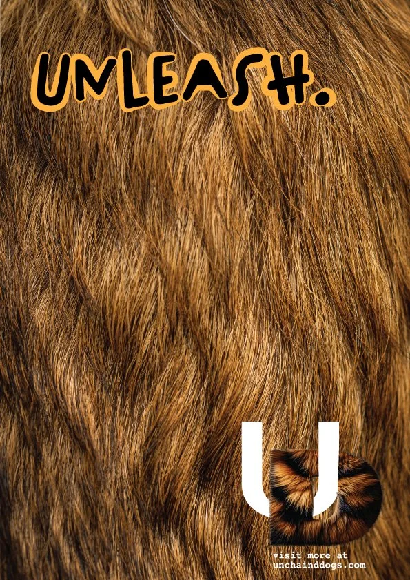
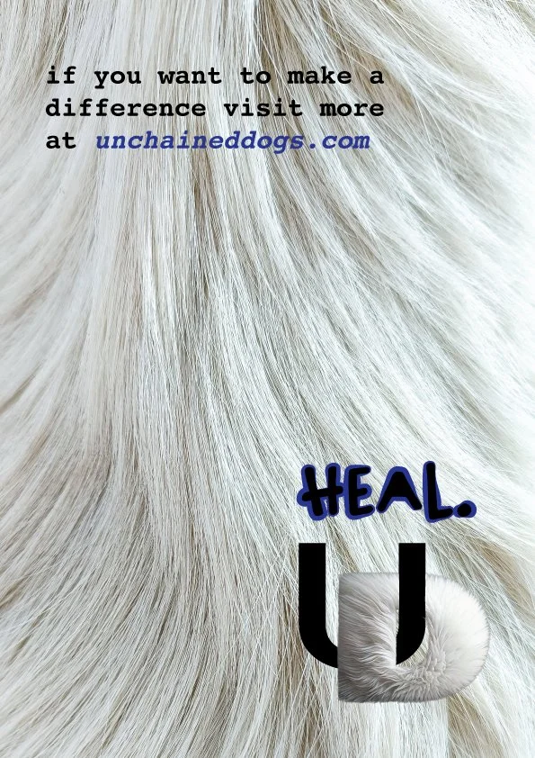
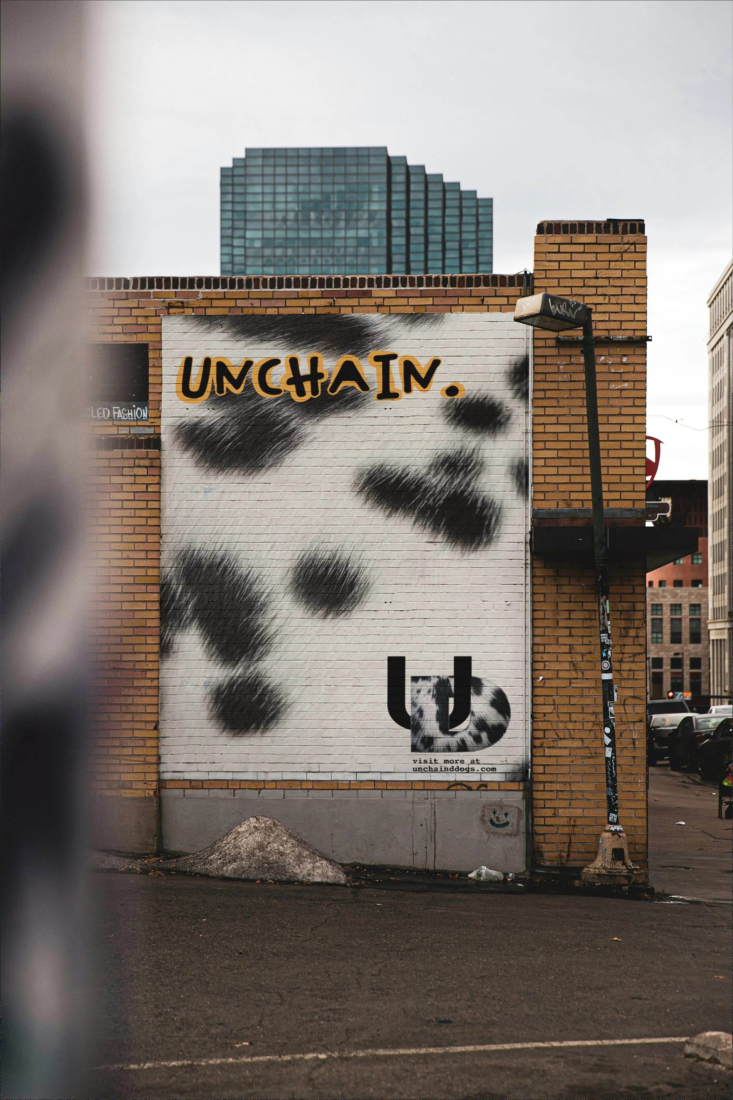
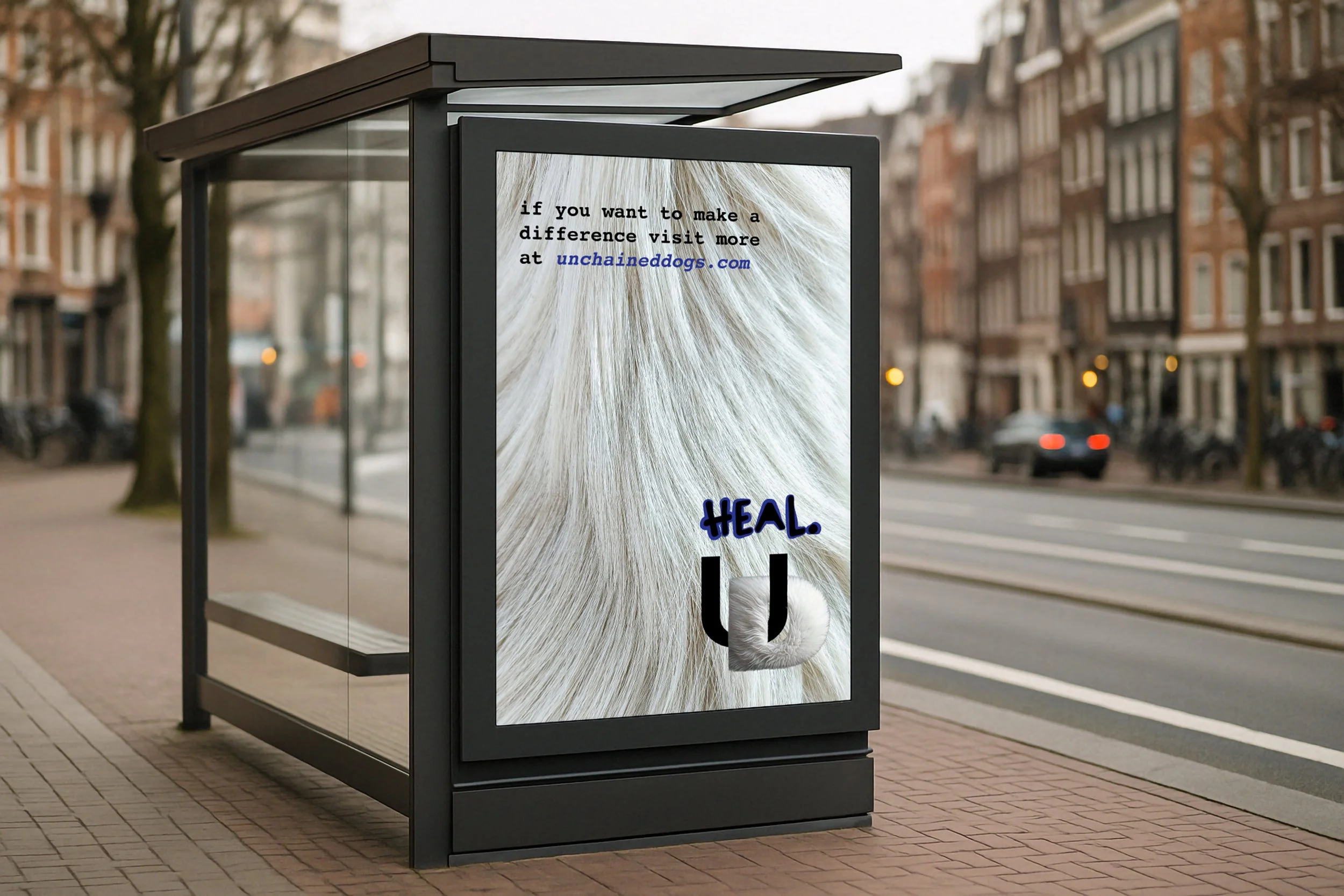
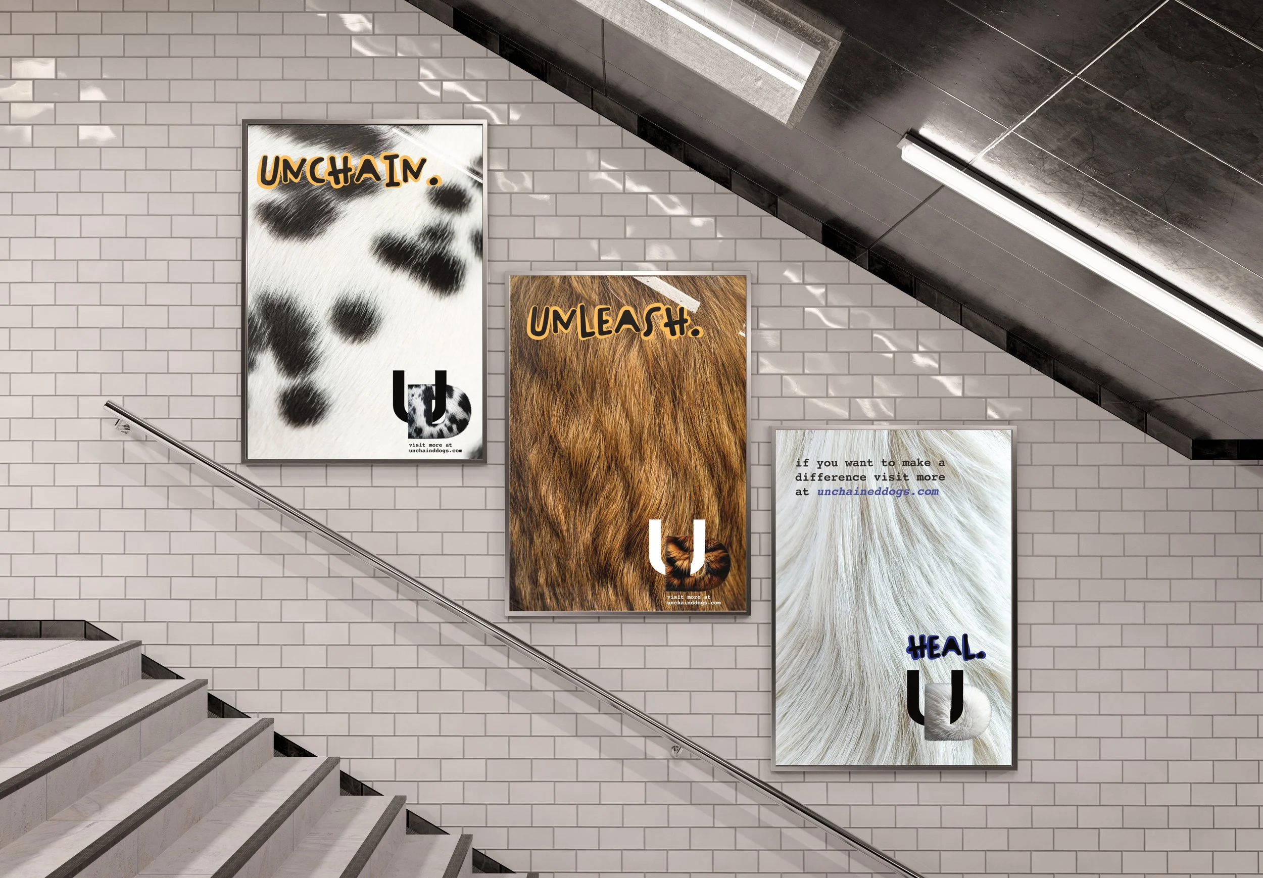
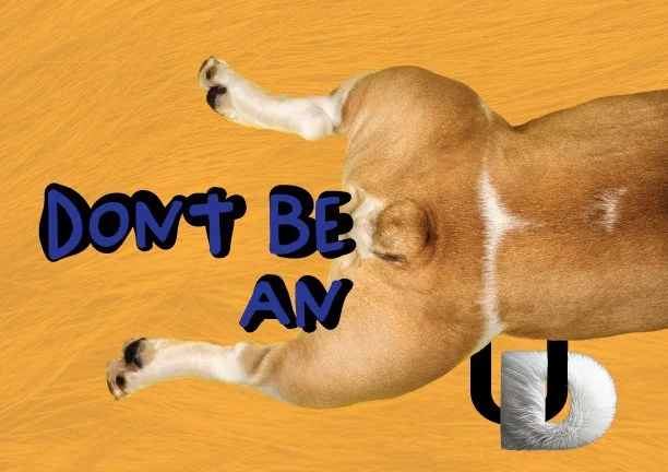
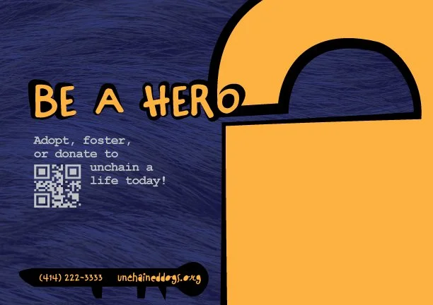
Poster Series

Poster 1
Poster 2
Poster 3
MOCKUPS

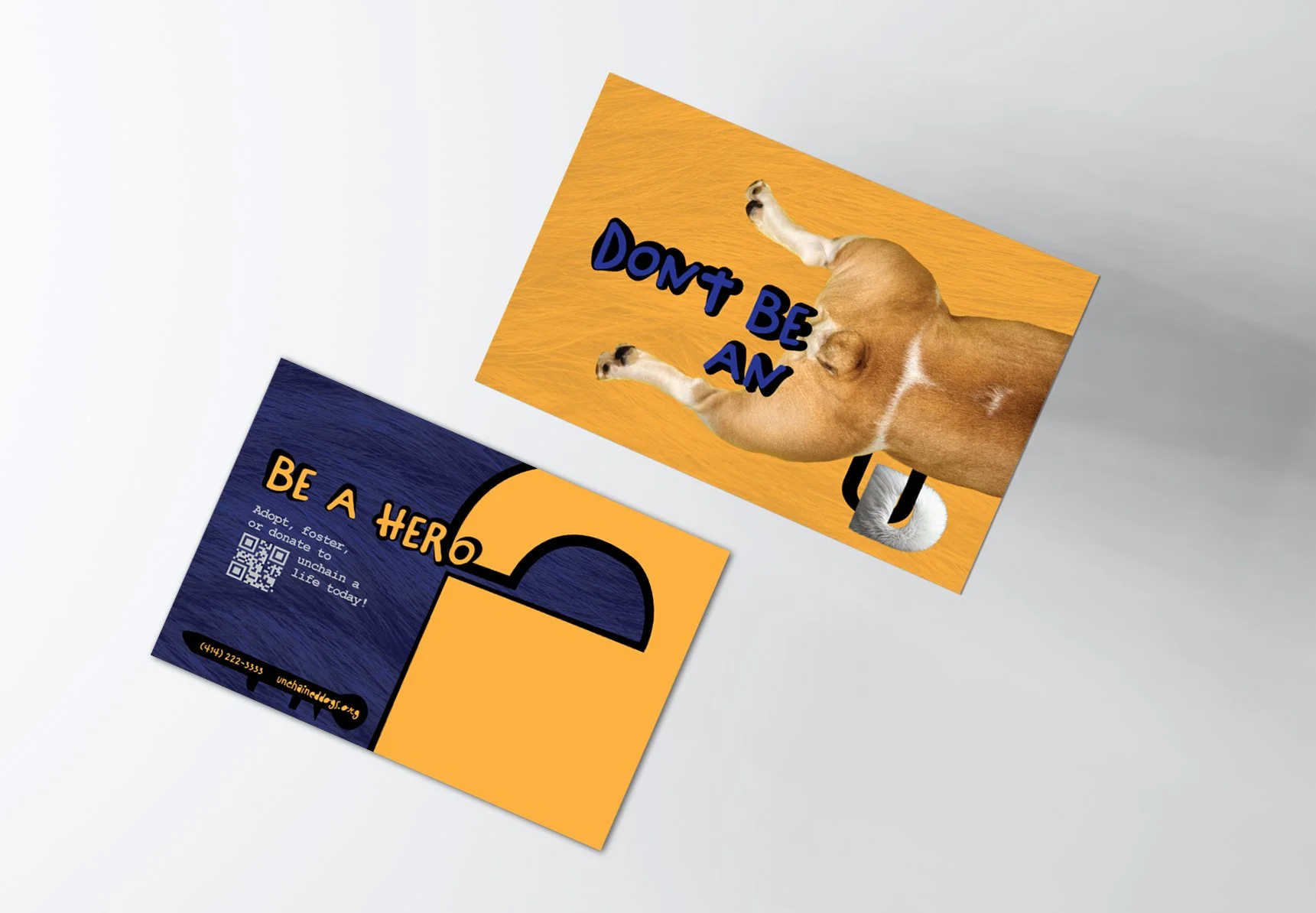
Direct Mailers
Front
Back
MOCKUP
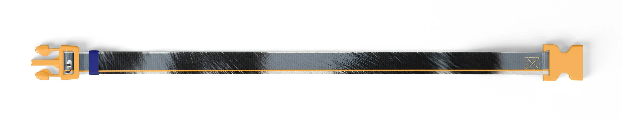
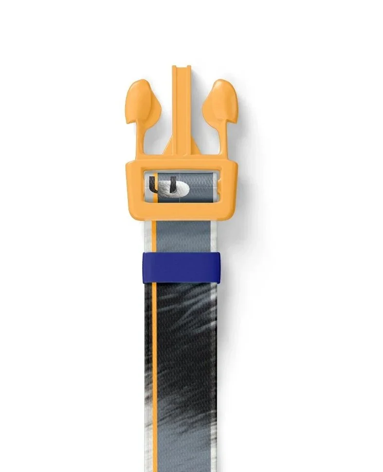
MERCH
MERCH

Dog Fashion
Dog Collars and Tag
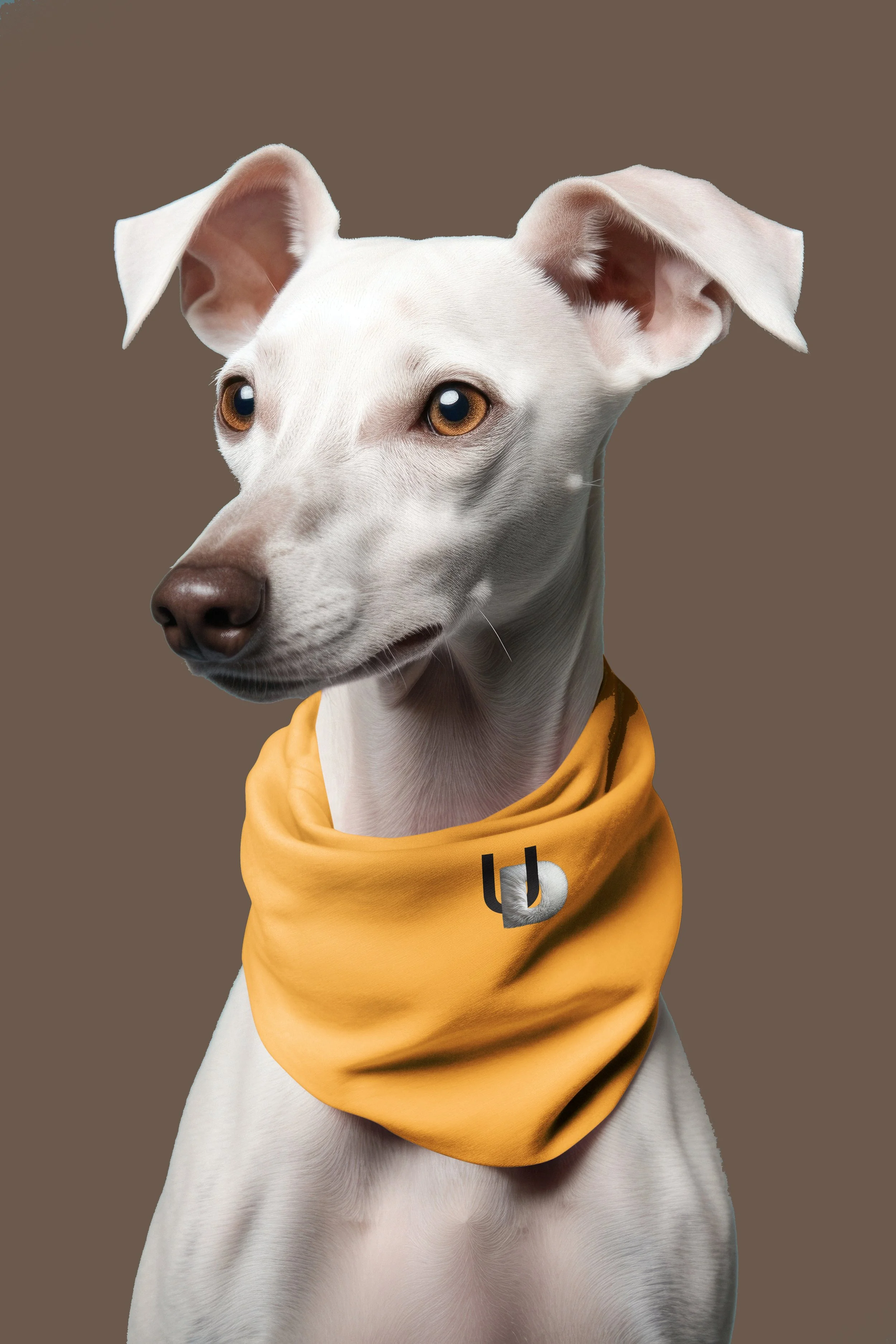
Dog Hoodie & Bandana

Human Tracksuit

Zip-Up Hoodie
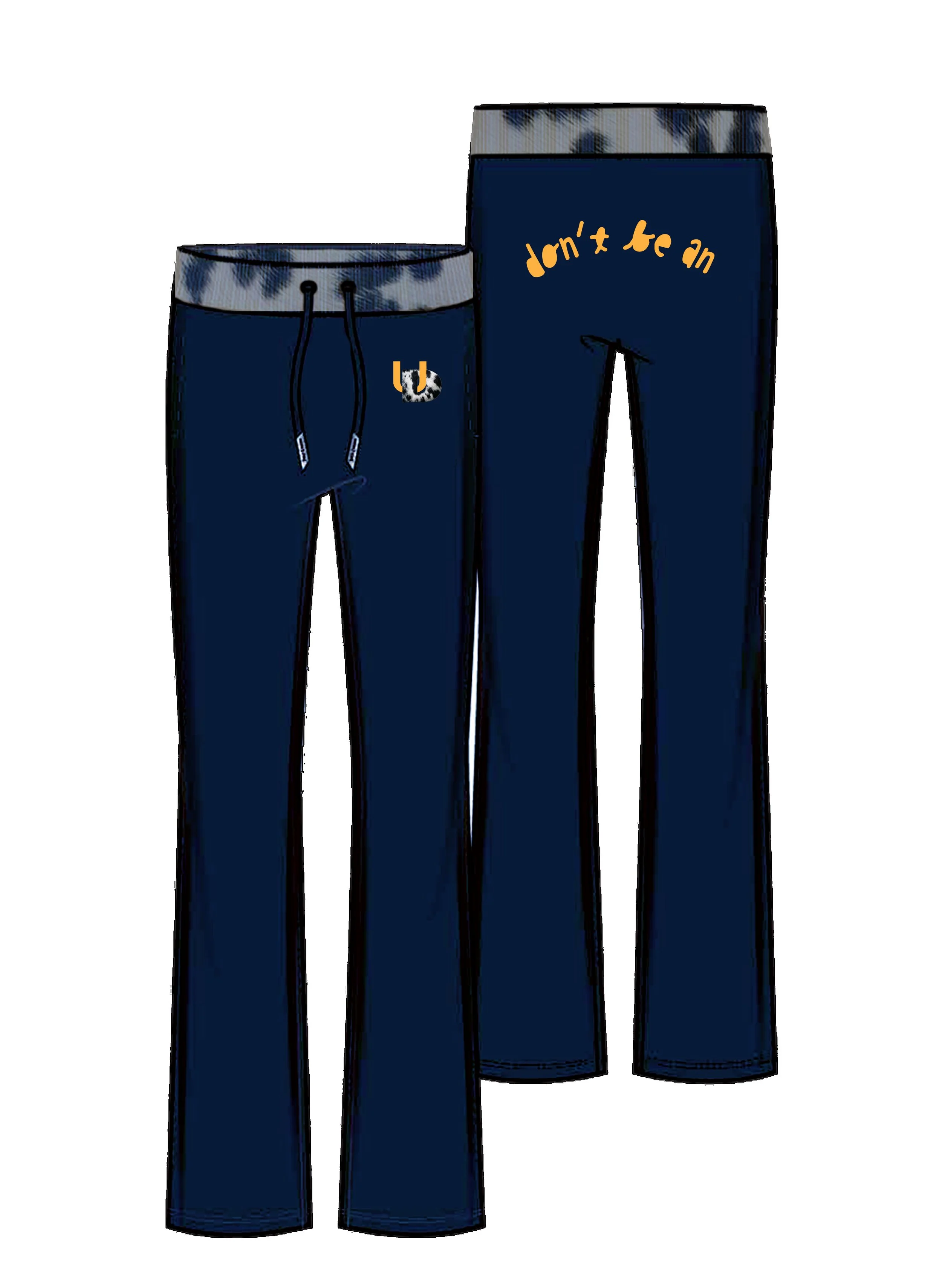
Flared Sweatpant
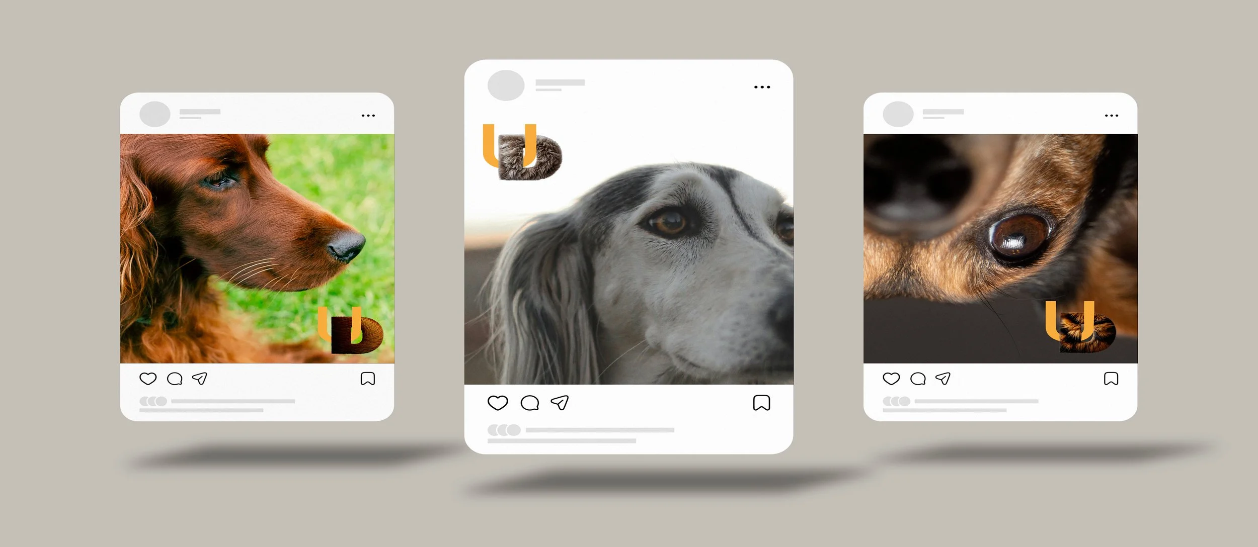
DIGITALS
DIGITALS